
Work / Brand Identity / Galex
A mark so liked, it outlived the name.
Galex was a startup 3D printer company when I started its branding. They liked the mark I drew and how iconic it was, so when they had to change their name for legal reasons they chose one that also starts with G and kept the mark. Galex became Genix, and I redrew the logotype for the new name.
The mark
From a hexagon to a letter.
The mark starts as a solid hexagon, becomes a cube and folds into a G, drawn in two blues: a flat shape turning into a solid object, which is what a 3D printer does.
It was sketched by hand first and holds up in metal, on dark paper and on a business card.
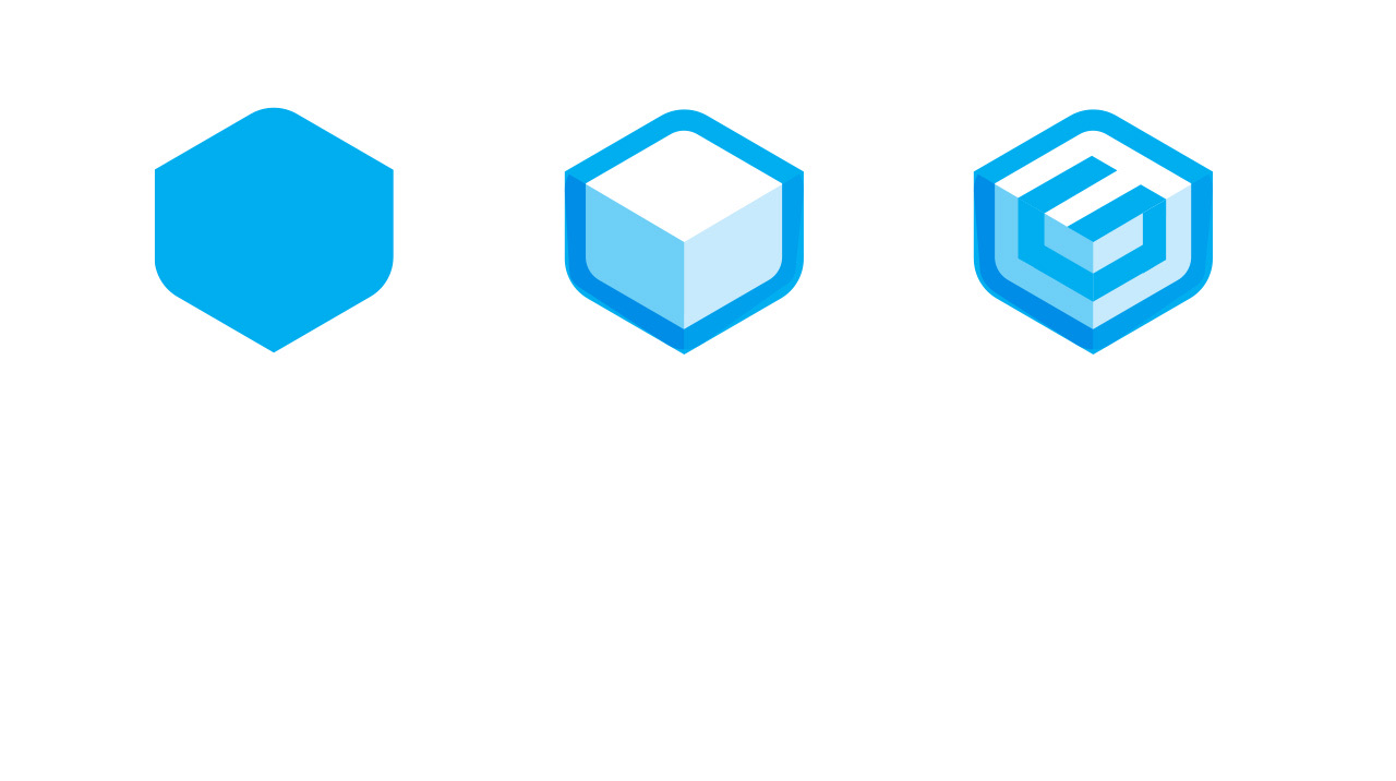 sketched by hand first

Brand sheet
Galex, at a glance.
Logo
Colour
- Galex blue#008DE8
- Light blue#02AEF0
- Night#141A27
Colours sampled from the logo, not the published values.
Type
Genix
Ubuntu Names and headlines
Desktop 3D printers
Barlow Text
Sub-brands
One G, a family of names.
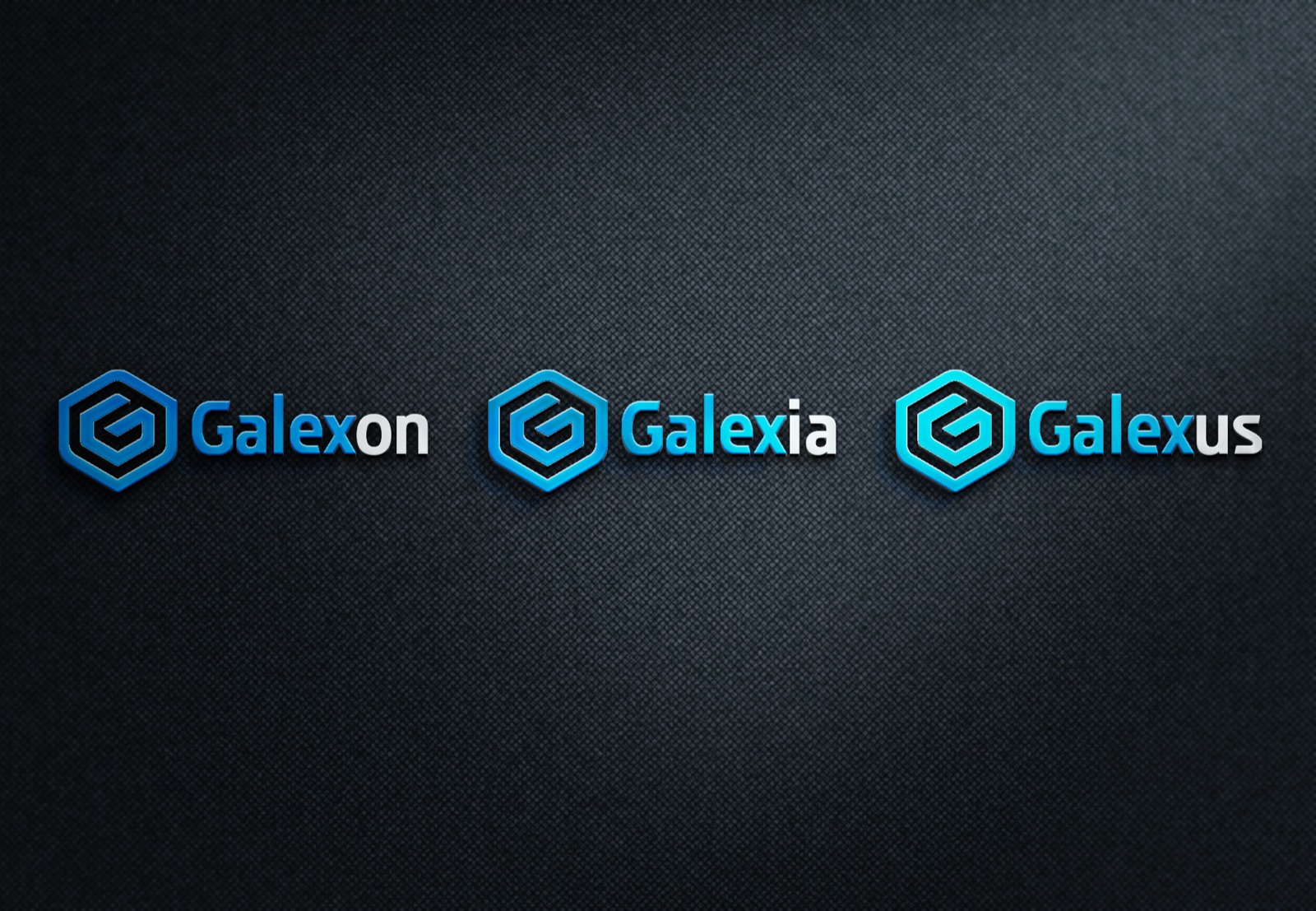
They asked how the company could name sub-brands. The answer kept the mark and the first syllable: Galexon, Galexia and Galexus, each carrying the same G, so every product line reads as part of one company.
The new name
Galex became Genix, the G stayed.
When the name had to change for legal reasons, the mark was the part they would not give up. They chose a new name starting with G so it could stay exactly as it was, and I redrew the logotype for Genix. The business cards carry the new name under the same mark.
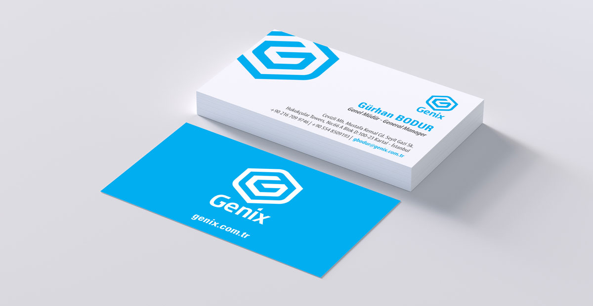 new name, same mark
