Work / Brand Identity / Hotbird
A bird folded from warm colours.
Hotbird is a social media platform. I designed its logo, its stationery and its web and mobile screens: a bird built from flat bands of yellow, orange and red, beside a rounded orange wordmark.
The mark
Flat bands, one bird in flight.
The bird is cut from straight bands of colour, from yellow at the wing tip to red at the body, like folded paper. It flies on its own on the mug and the cards, and leads the wordmark everywhere else.
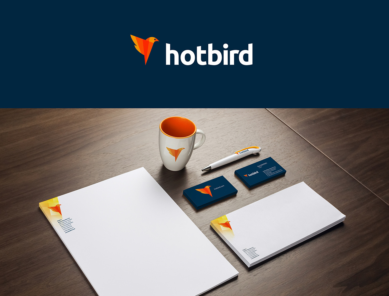 from yellow to red
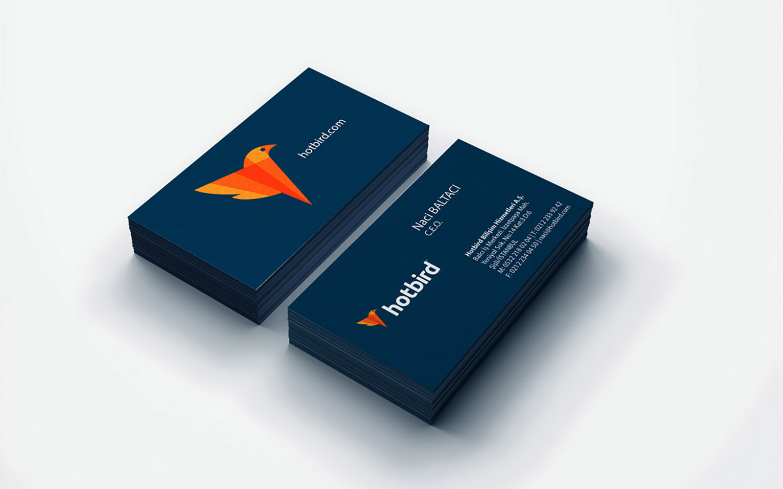
Brand sheet
Hotbird, at a glance.
Logo
Colour
- Flame#E26116
- Orange#DF871F
- Navy#083350
Colours sampled from the logo, not the published values.
Type
hotbird
Varela Round Headlines, lower case
Join the conversation
Nunito Text and interface
On screen
The same warmth, on every screen.
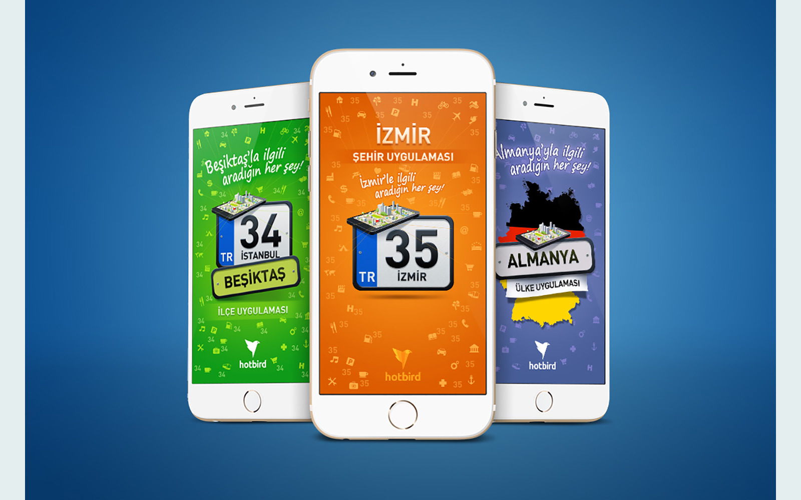
On the website and the phone screens the orange and the navy of the cards do the work: a clean feed on the web, and city pages in bright orange on mobile.
 city pages, in orange