Work / Brand Identity / Mediteria Clinic
A clinic brand, from the name up.
A new high-end clinic in Dubai with three businesses under one roof: medical operations, beauty treatments and a relaxation space for recovery and self-care. I gave it its name, its mark, its colours and a system that keeps the three apart without splitting the brand.
The name and the mark
A name that could hold all three.
Mediteria is Mediterranean and medical in one word: the warmth and ease high-end clients in Dubai associate with the Mediterranean, and the expertise of a clinic.
The mark is a tall, fine-lined M in gold, with a narrow serif wordmark and DUBAI spaced out beneath it. It holds on dark paper as well as light, which is where a clinic's first impression is made: on the card in a patient's hand.
 a fine-lined M, in gold
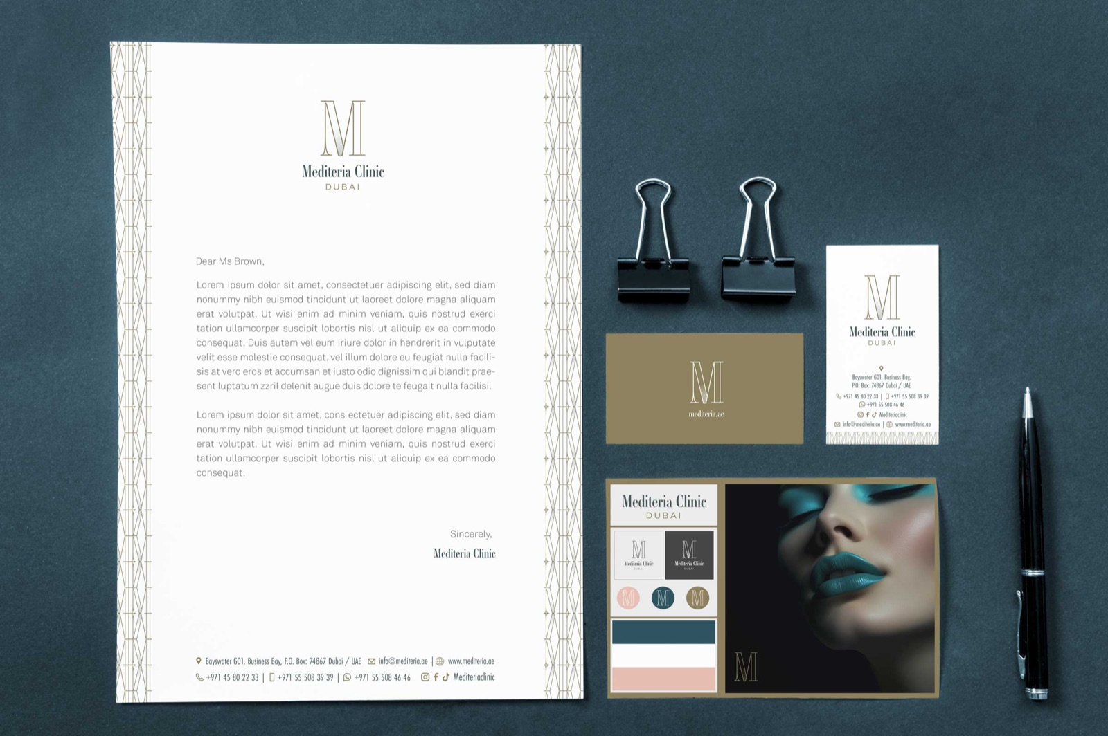
Brand sheet
Mediteria Clinic, at a glance.
Logo
Colour
- Mediteria gold#8B754E
- Deep teal#174350
- Blush#E7BBAE
Colours from the brand's own palette as shown in its case study.
Type
Mediteria Clinic
Cormorant Garamond Names and headlines
Dubai
Jost Labels, spaced capitals
The three divisions
Colour tells the three apart.
Each division has its own ground and its own lattice of tall diamonds drawn in the same hand as the M: deep teal for Medical, ivory for Cosmetic, blush for Relaxation. The gold runs through all three, so they never stop being one clinic.
 one drawing, three grounds