Work / Brand Identity / Teno
Toilet paper, with a softer name.
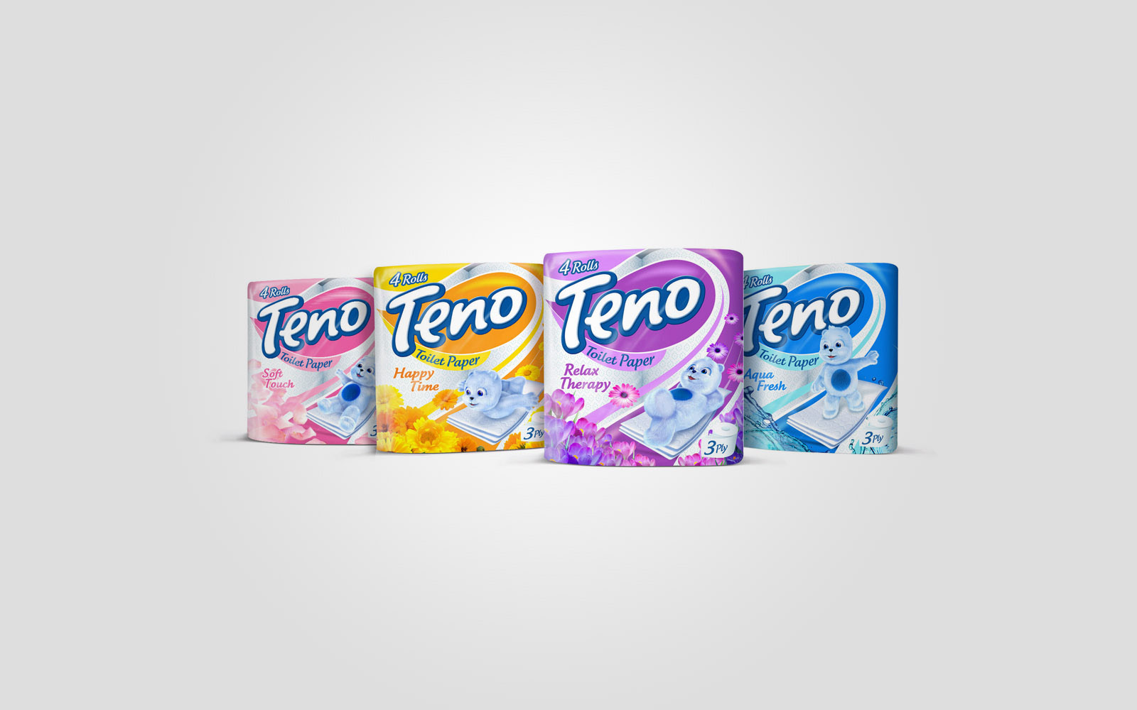
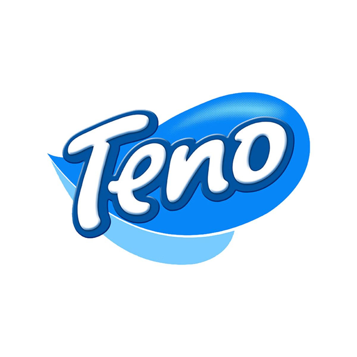
Teno is a toilet paper brand. I drew its logo, a white script on a bright blue cloud, and carried it onto the packs, where a soft blue bear shows how gentle the paper is.
The logo
A script on a soft blue cloud.
The name is written in one rounded, upward-leaning script, outlined in white so it lifts off the blue cloud behind it. It reads as soft before you touch the paper.
 soft before you touch it
Brand sheet
Teno, at a glance.
Logo
Colour
- Teno blue#0B88F6
- Deep blue#095299
- Sky#6FBDF2
Colours sampled from the logo, not the published values.
Type
Aa
Soft Touch
Baloo 2 Headlines and variant names
Aa
3 ply, 4 rolls
Nunito Text and pack details
The packs and the bear
One bear, every variant.
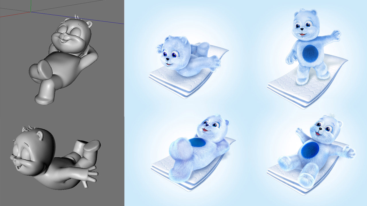
Each variant has its own colour and scent, and the same blue bear lies on the paper on every pack. It was modelled in 3D, so it can be posed for each one.
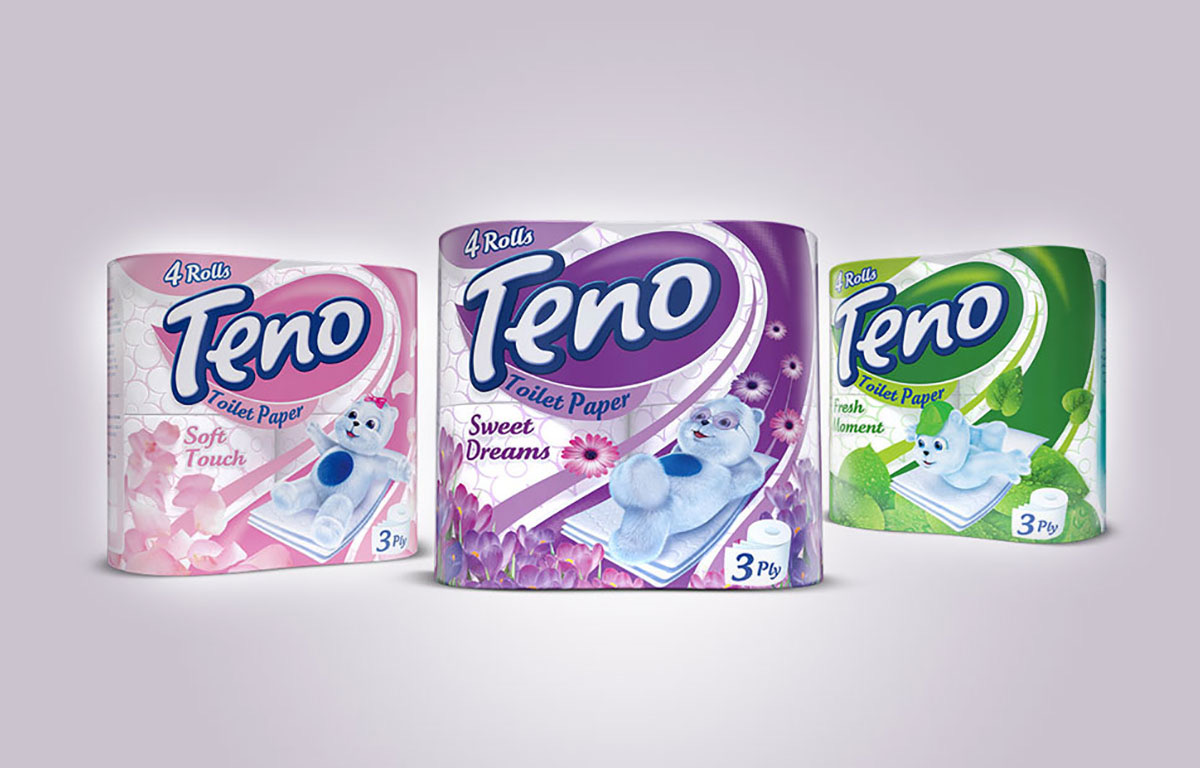 modelled, then posed