Work / Brand Identity / MTNS Solutions
A security firm, shaped like a shield.
MTNS Solutions designs, builds and manages networks for enterprise clients from Toronto. I gave the company its corporate identity and then its website; the founder credits me with both.
The mark
Bars that close ranks.
The mark is a shield built from vertical bars, set beside a heavy italic wordmark in navy. It reads as protection at a glance, and the bars work on their own wherever the full logo will not fit.
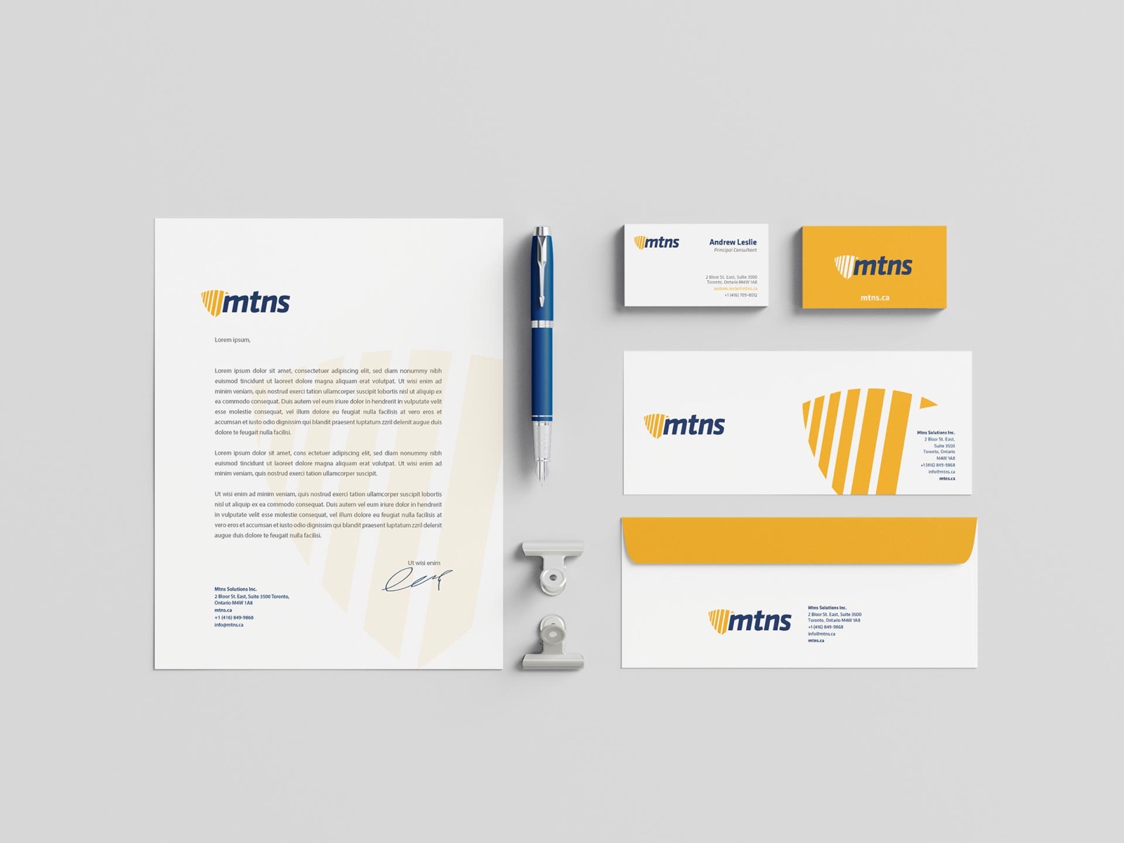 the bars work alone too
Brand sheet
MTNS Solutions, at a glance.
Logo

Colour
- Navy#002D5D
- Amber#FBA71A
Colours sampled from the logo, not the published values.
Type
Aa
Securing networks
Exo 2 Headlines, italic
Aa
Managed network services
Titillium Web Text and interface
The website
Letterhead to landing page.
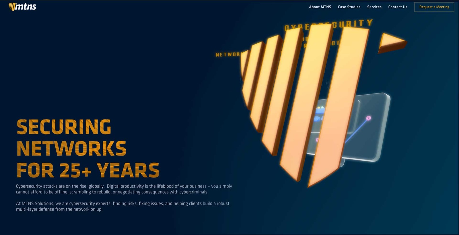
Navy and a warm amber carry every piece. On the site the shield becomes a three-dimensional object the headline sits beside.