
Case Study
Dodoner
The brief
The work started before there was a brand to design. Selda Oncel came back to Akin for her second restaurant, and the first thing it needed was a name.
Dodoner is that name. Everything after it was built outward from the word itself: the mark, the packaging, the signage on the street, the menus inside, and a responsive 3D website.
A mark cut by hand, not drawn by rule
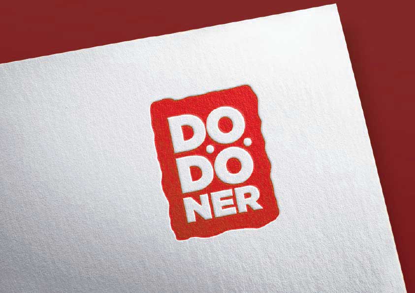
The badge is rough edged and irregular, closer to something pressed into paper than something set on a grid. It had to hold at three very different sizes: a stamp on a takeaway wrapper, a sign above a door, and a logo in motion.
Animated logo
The animated build of the mark, used as the opening frame across Dodoner's digital menu screens and social templates.
One badge, two readings
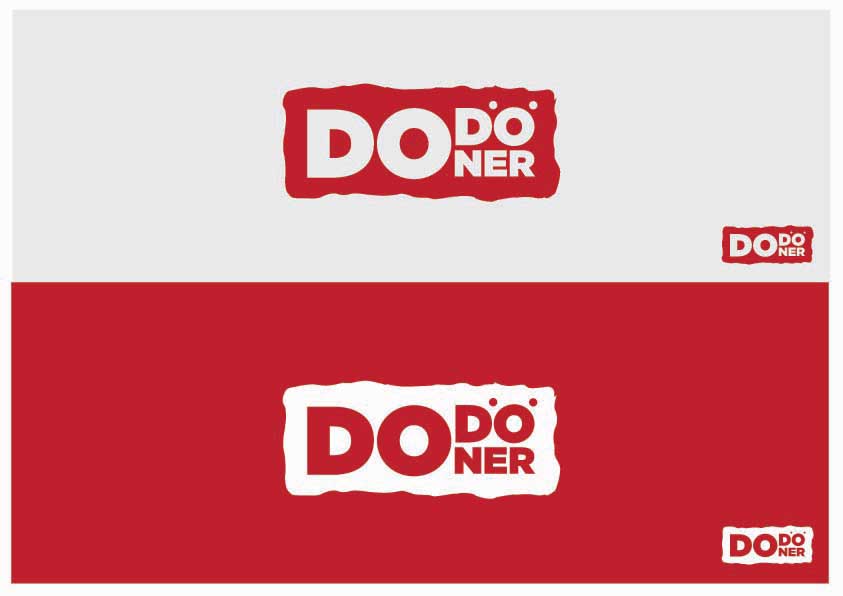
A horizontal lockup for fascias and screens, a stacked one for wrappers, cups and stamps. Both run positive on light and reversed on the brand red, so the mark never needs a box drawn around it.
The founder
Selda Oncel credits Akin with creating the business name itself, then developing the identity, the packaging, the signage and the website, with the result matching what she had pictured.
Selda Oncel / Founder, Dodoner
Recounted from the founder's testimonial rather than quoted, so that no wording is attributed to her that she did not write.
A responsive 3D website
The identity carried through to a responsive site built around 3D product imagery, with the same badge, red and rough edge holding it together.
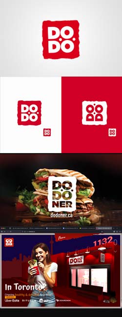
Scroll the page and the capture scrolls with it, so the site is seen end to end rather than as a cropped screenshot of its header.
What was delivered
- 01Naming
- 02Logo
- 03Brand identity
- 04Packaging
- 05Signage
- 06Outdoor graphics
- 07Flyers
- 08Food menus
- 09Digital menu screens
- 10Social templates
- 11AI imagery
- 12Animated logo
- 13Responsive 3D website
Credits
Client
Dodoner
Founder
Selda Oncel
Role
Naming, brand identity, packaging, signage, digital
Sector
Food, restaurant, local