Akin Tangun/Portfolio/Molfix
A baby brand, redrawn to be friendlier.
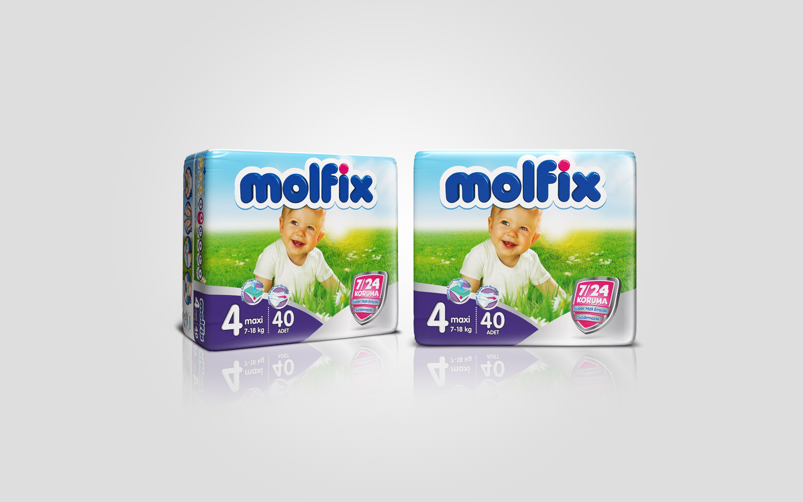
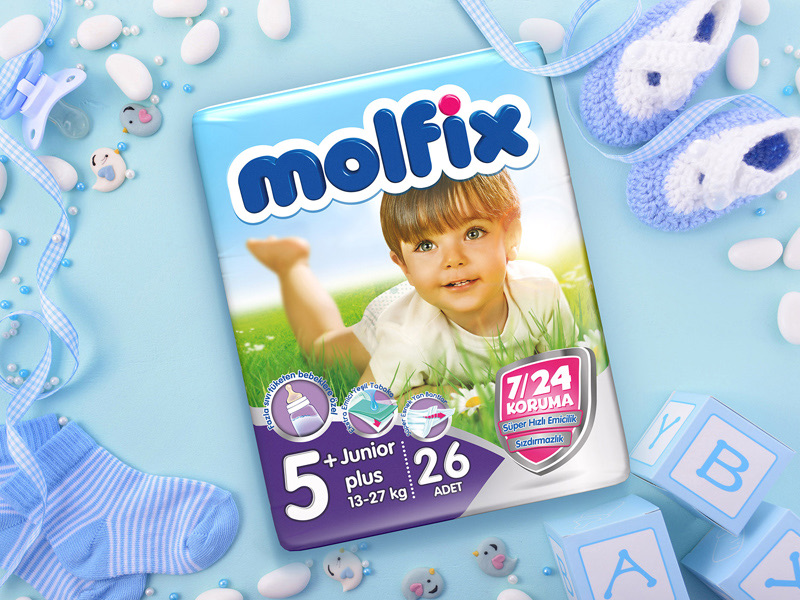
Molfix is the baby diaper brand of Hayat Kimya. I redrew its logo and carried the new identity across the packaging, so the same friendly word leads every pack in the range.
- Brand
- Molfix
- Company
- Hayat Kimya
- Role
- Logo, brand identity, packaging
- Reach
- Sold in 72 countries
Market leader in 4
Before and after
The old mark, and the new one.
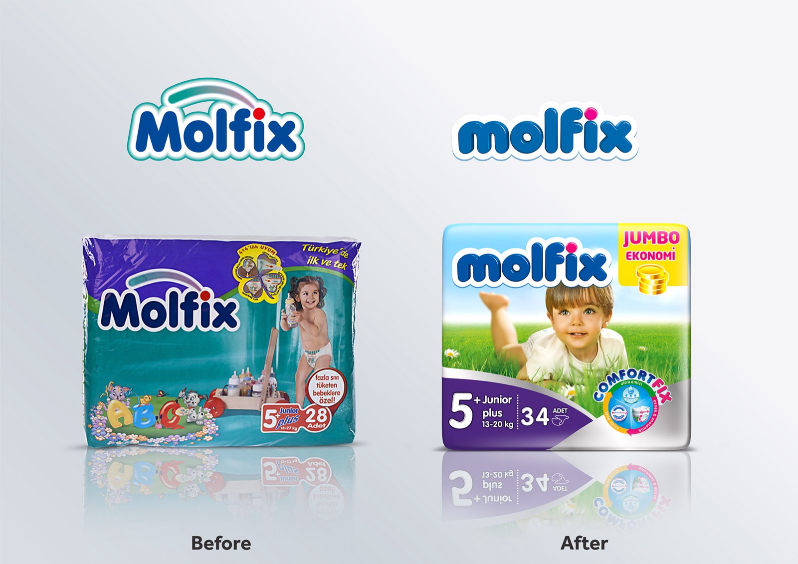
The earlier logo sat under an arc, in outlined letters. The new one is a single rounded wordmark, heavier and simpler, so it reads from further down the aisle and still holds together when it is printed small.
The picture shows the two side by side, each on the pack of its time.
The mark
One word, two alphabets.
The wordmark was drawn twice: in Latin letters and in Arabic script. Both share the same weight, the same soft corners and the same white edge, so the brand looks like itself wherever it is sold.
Latin
Arabic
On the pack
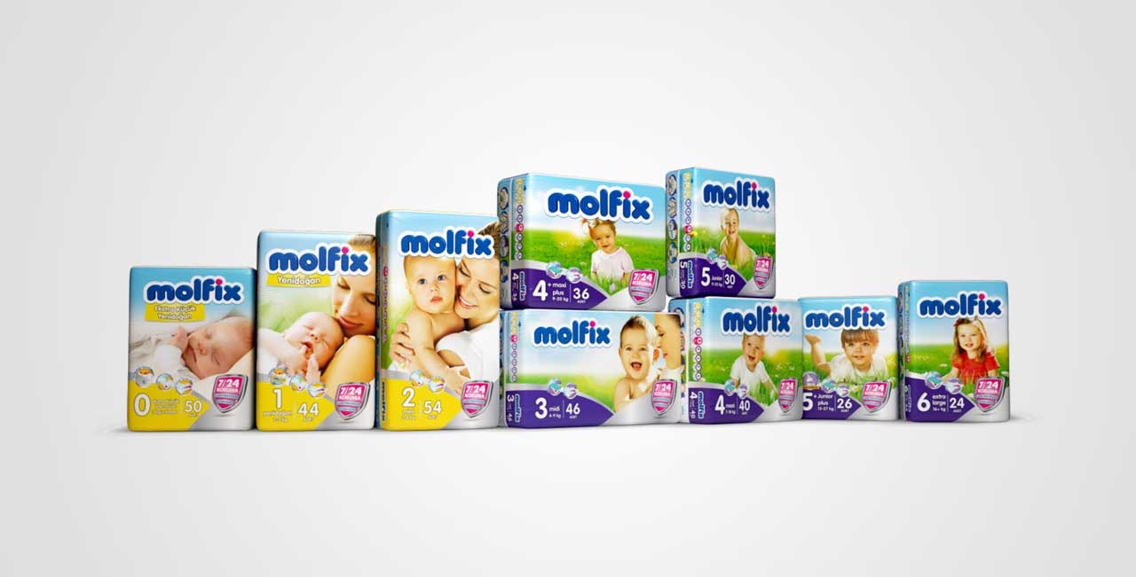
The same face, on every size.
On shelf the logo leads each pack, above the photograph and the size. Put the range together and it reads as one family.